
Disclaimer: With ever increasing standards of customer satisfaction, mainly driven by daily consumption of apps made by world-famous brands like google, facebook, or microsoft, the level of effort you have to put to match that satisfaction is rather unsurmountable – but not impossible. On the other hand, the standard of Mobile Apps and Websites, developed and consumed in Pakistan, is fairly low but gradually increasing. With this in mind, we will review the apps/websites and bring forth for them a generous review, so that they can reflect on improving it. With our best judgement call, the review is done by individuals like us and can be wrong as well. So don’t take it as final verdict and as soon as the problems are fixed, the app developer can contact us to re-visit it.
________________________________________________________________________________________________________
CompareBox.pk – is a product comparison site which provides detailed description of products and enable the user to compare it in a fairly easy and convenient way. You can also buy the products by finding the respective seller.
Below, we have presented a review of the service from consumer perspective. The idea is to share the best things about the service and highlight the problems that are overlooked. Now, lets dig in!
Best parts of the service
- Comparison feature is great in itself, listing all the possible details of products in vertical columns, helping user to see and compare the items side-by-side.
- “Find seller” for a product shows reasonable number of sellers on most of the categories especially electronics, mobiles, and automobiles
- Video ad is nice.
- Item details in various categories are in fine-grained detail which helps the user to view the specifications in full length
- The team is responsive on social media.
- “Buy Now” button on items takes you instantly to the merchant store where you can buy the item directly.
Critique
After reviewing the site in rather minor detail, we found several things just 1-click away that can be improved. They are identified in the following areas,
- Overall compare service,
- Search,
- Home Page, &
- ‘Find Seller’ feature
1. Overall service
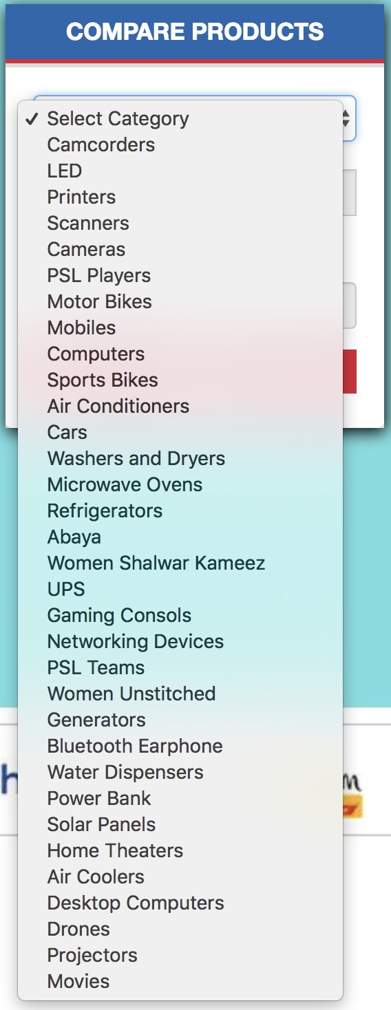
Product Category List on Homepage
On home page of the site, the Compare Products feature shows a drop down list of categories. After looking at the list, you cannot quickly navigate to the right category as its not in order and not in right groups, e.g this order
…
Refrigerators,
Abaya,
Women Shalwar Kameez,
UPS,
Gaming Consoles,
….
Screenshot:
Multiselect Item Comparison
I wanted to compare motorbikes, I selected “Yamaha Junoon” motorbike. Once I clicked “yamaha Junoon” in the search result, I was taken to this page below, now there is no way I can select another bike, except you have to manually search or guess the bike in the textbox. User cannot select multiple items at the same time to compare (see a nice implementation of multi item comparison by smartchoice.pk). It looks like a missing feature that should certainly be available especially for a comparison site.
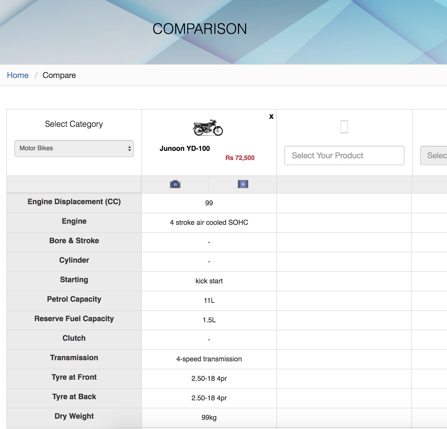
UI of comparison columns is good though, when i write some random bike name, it loads fine.
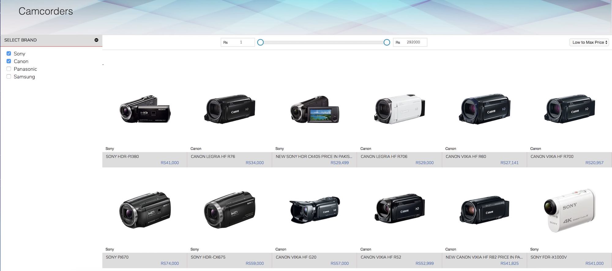
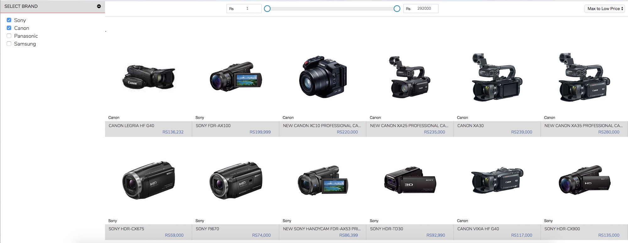
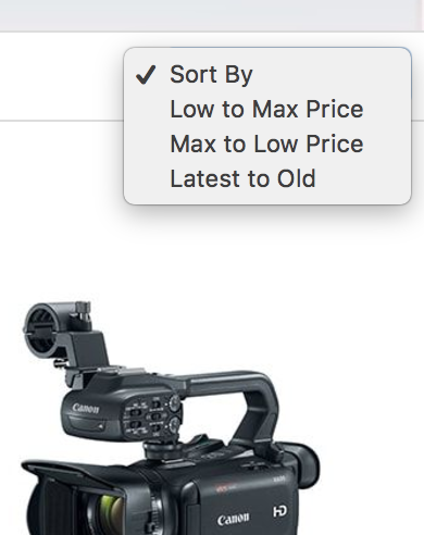
Sorting of Items
Sorting by price does not work. And selecting “Low to Max Price” and then “Max to Low Price”, the items are listed in wrong sort order. Evident from screens below,
Low to Max Price: Starts with Sony HDR-PJ380 (Rs. 41000) whereas Sony CX405 (Rs. 29499) is after. Should be fixed easily by sorting-by-price
Max to Low Price: Same sorting problem, the other way around. The prices are mostly random. Need to fixed. These are small things but important ones.
Default Sorting List Option is “Sort by”
What does ‘Sort by’ means when it’s also clickable. First, it should mention some default behavior and secondly, this type of text on top of lists are usually not clickable (unless its behavior is also shown). It can be easily fixed by not making it clickable first or just remove it, and make an actual filter the default option.

Price Alert feature is broken
I added invalid input, it broke but says “Price alert set successfully”, you can see all the errors here. This can be easily fixed by doing client side input validation, there are several ways of doing it but using JS based input validation is quite common.

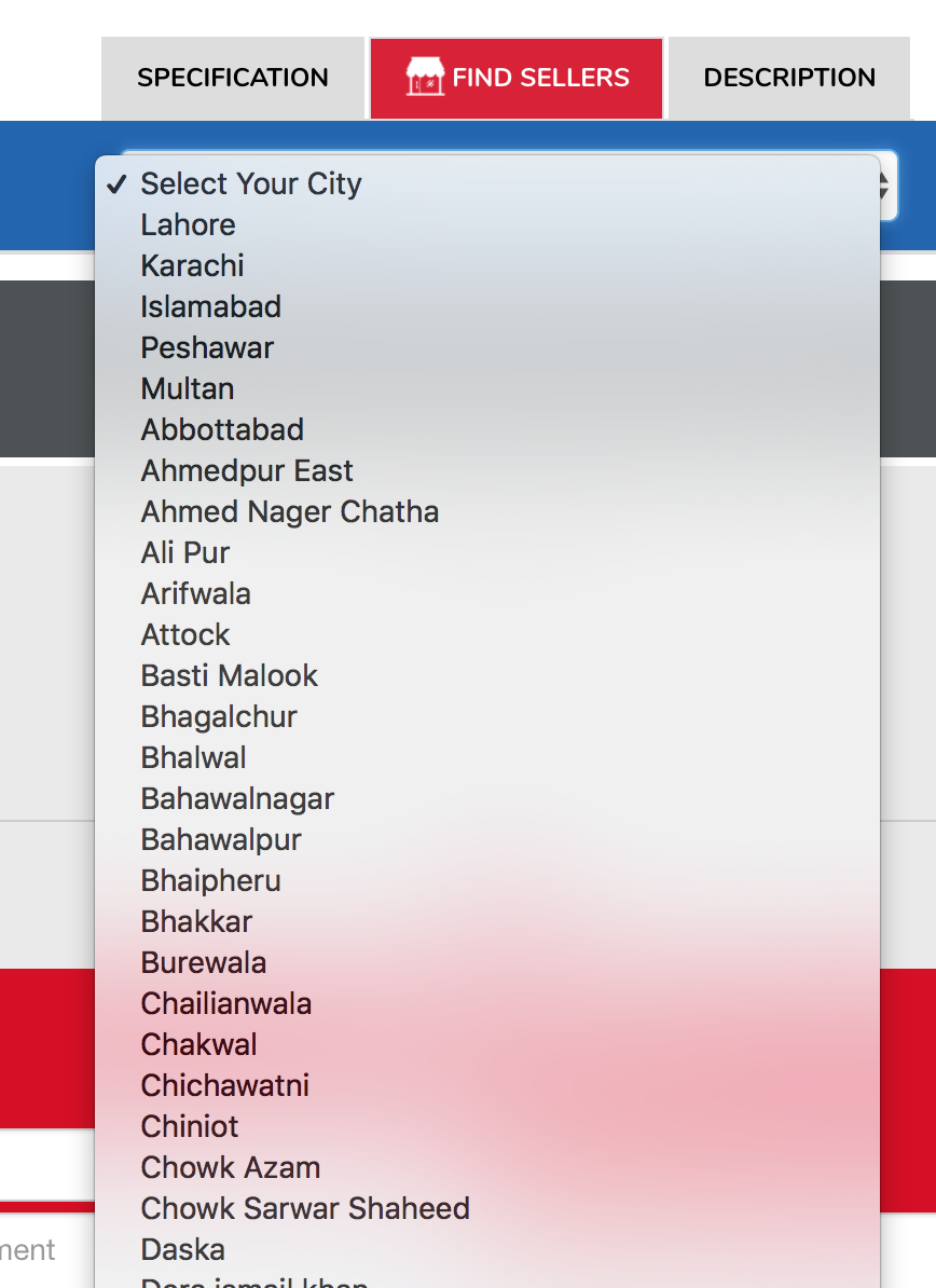
Separator in Dropdown list for cities
Its optional, but a horizontal line-separator between main cities and rest of the cities would have been better. Optional
Comment Box
Submitted an empty comment but says Successfully submitted in red. As discussed above, it can be easily fixed.

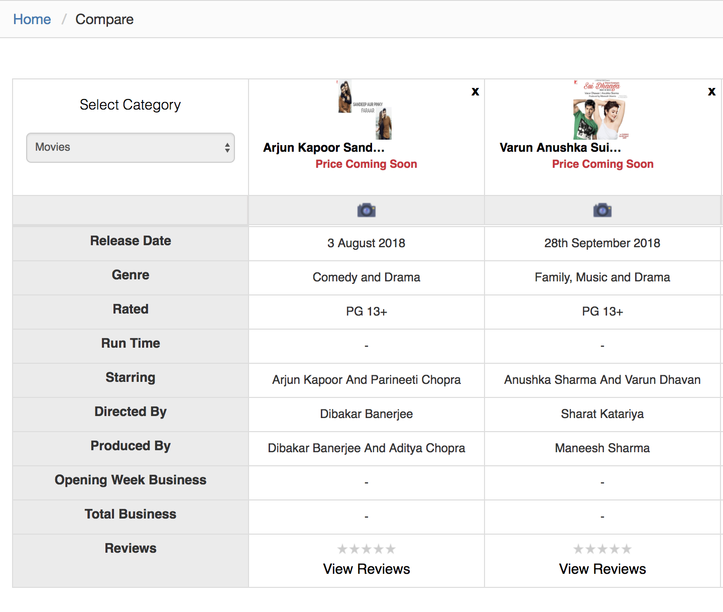
Entertainment/Movies – Confused Branding
Entertainment/Movies is one of the 9 main categories available in the site. Its relative, but this category is out of place. People might be coming to the website because of movies but is it really the purpose what website serves?
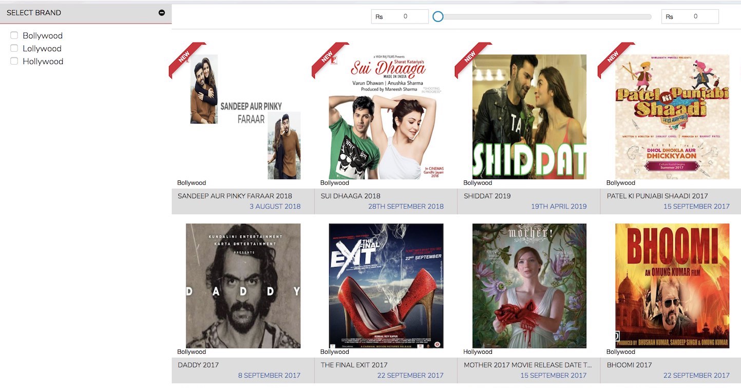
The comparison of Movies on a product comparison site has little to do with. Movie comparison is something that every individual has its own liking and does not bring value comparing their specs (e.g. Genre, Rated, Run time, …)
UnClickable Top Brands
Half the Top Brands in first row are not clickable. Should be easily fixed by making them clickable. Being not clickable, the purpose they serve is very little as it will not increase any user interaction. Define criteria for bringing them on Top as well (like number of views, or paid customers, or high traffic …)

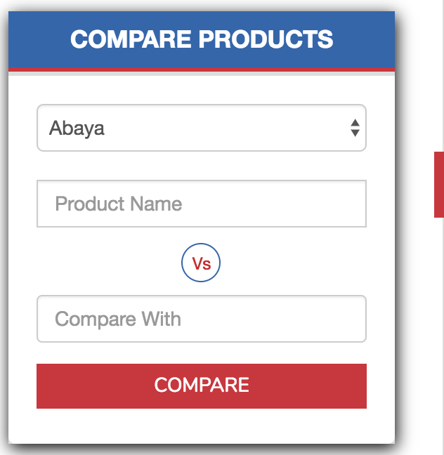
‘Compare Products’ box
The “vs” sign on compare box is abit confusing and looks abit unprofessional. This compare box has to be intuitive enough so that user should not spend time to figure out how to make selection of products, unless you know the name of items that you want to compare .e.g. The category ‘Abaya’, how would user know the Product Names under this category?
Home Page Banner
The home page banner moves very slow and there is no way to move it to next screen. The circles at bottom that usually supposed to navigate the images in banner are not working. This is a bit irritating.

We stopped reviewing the UI/UX features after skimming few pages. You can request a full review on demand.
2. Search
Search is not perfect
I searched for “Honda City” and this is what we get after loading some more results, refrigerators, washing machine,…
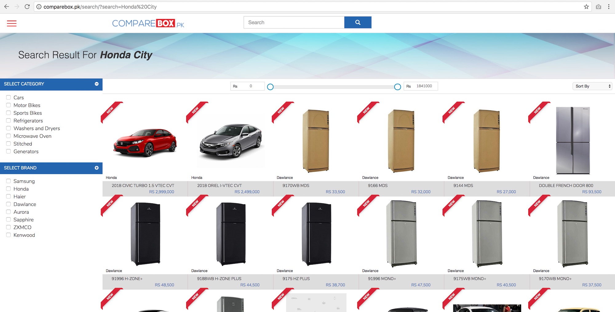
When I load further results, I get a Women’s Sapphire Kurta (Sapphire Bliss of Simplicity) and the likes of samsung washing machine:
I know what is happening here, since ‘Sapphire Bliss of Simplicity’ contains ‘city’ in its text, the search (Honda City) is doing a simple wild search for matching characters and missing a very important context search for a given query text. If I would have written just city than this search result would have been acceptable, but user is giving you complete context information “Honda” + “City”. Its easy to fix this to make search a little smarter. Try levenshtein distance on search or make sure to have Honda and City in the returned search results.
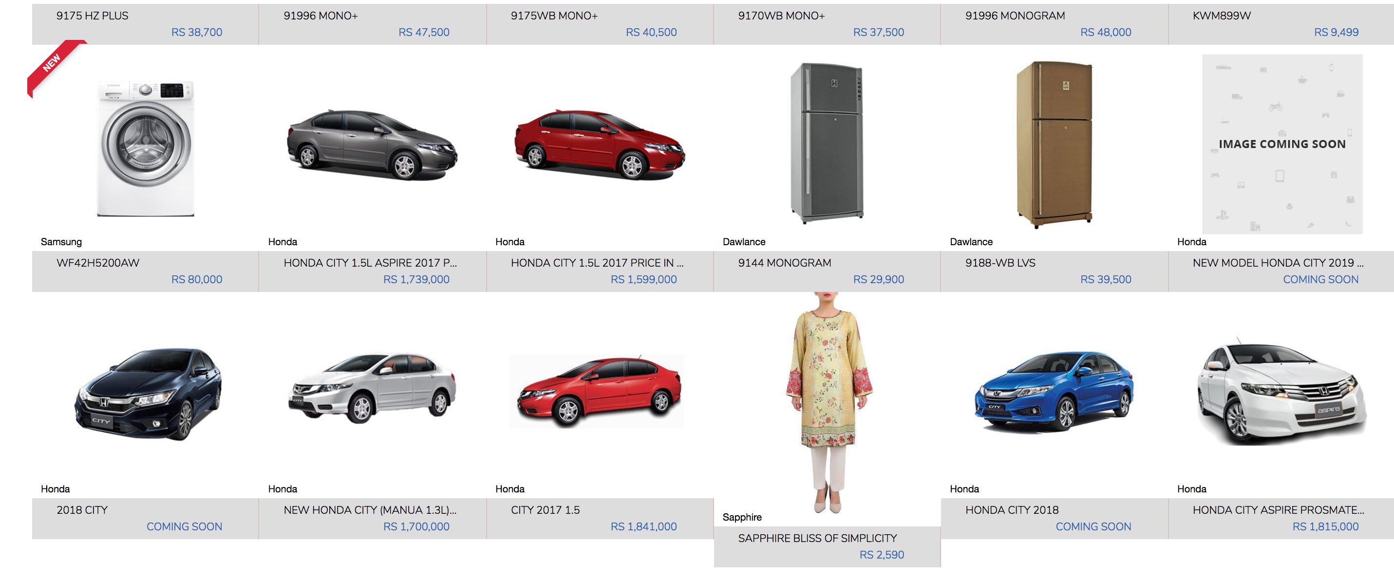
Result items Description
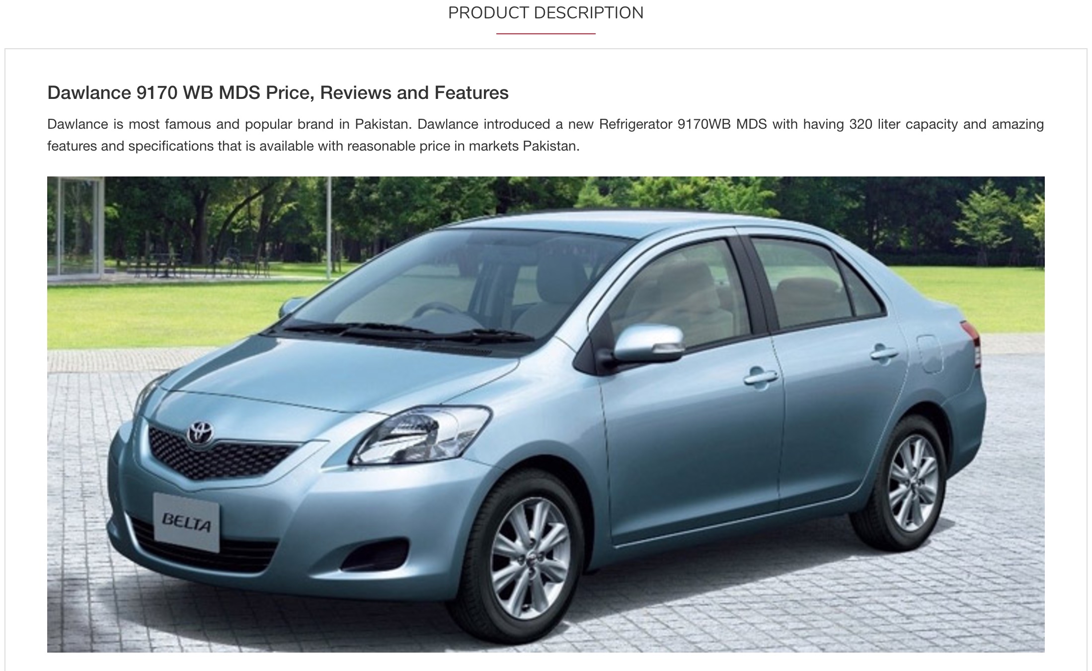
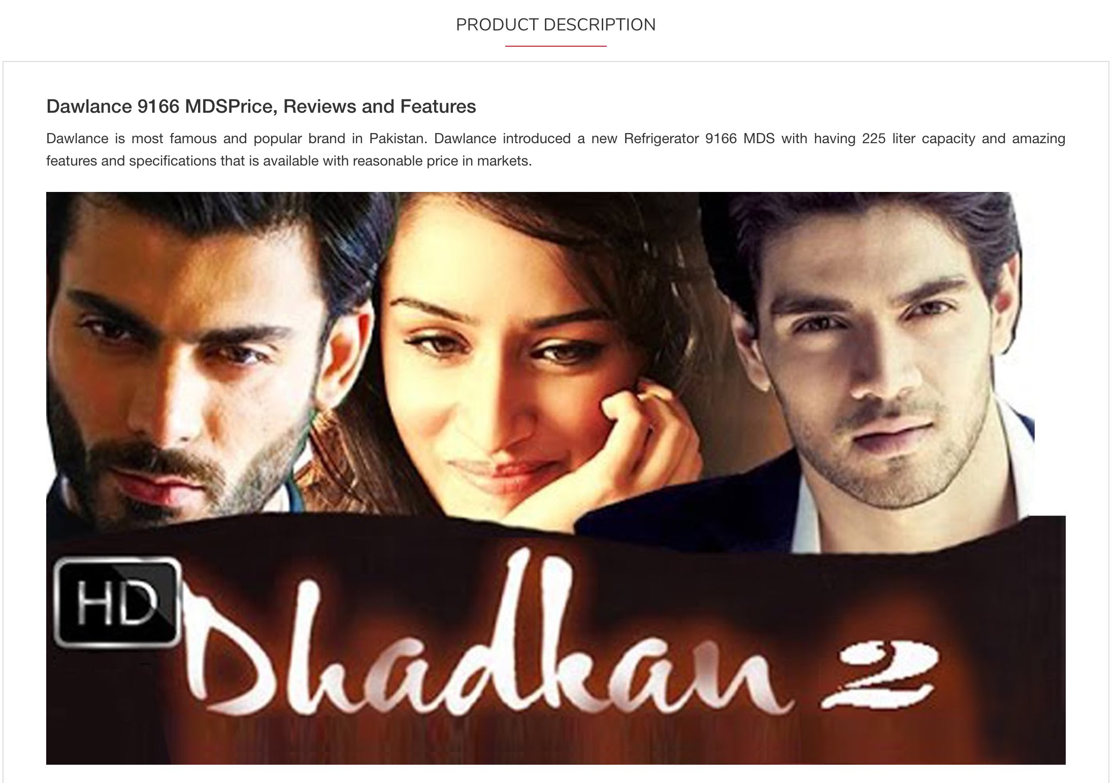
Although, it’s not related to search itself but about the search results. On 2-click away from home page and just one-click away from doing the search, if I get this type of item description, I would loose all the customers. I clicked one of the search results from ‘Honda city’ search, i.e. “Dawlance 9170 WB MDS” and this image of car ended up in the middle of Refrigerator description,
http://comparebox.pk/Refrigerators/Dawlance-9170-WB-MDS-price-in-Pakistan-Features-Specs-Reviews
I don’t know why they are showing a toyota car picture for the descriptuon of Dawlance 9170 WB MDS
Another one “Dawlance-9166-MDS” from the same ‘Honda city’ search,
https://comparebox.pk/Refrigerators/Dawlance-9166-MDS-Price-in-Pakistan-Specs-Reviews-Features
And another from different search,
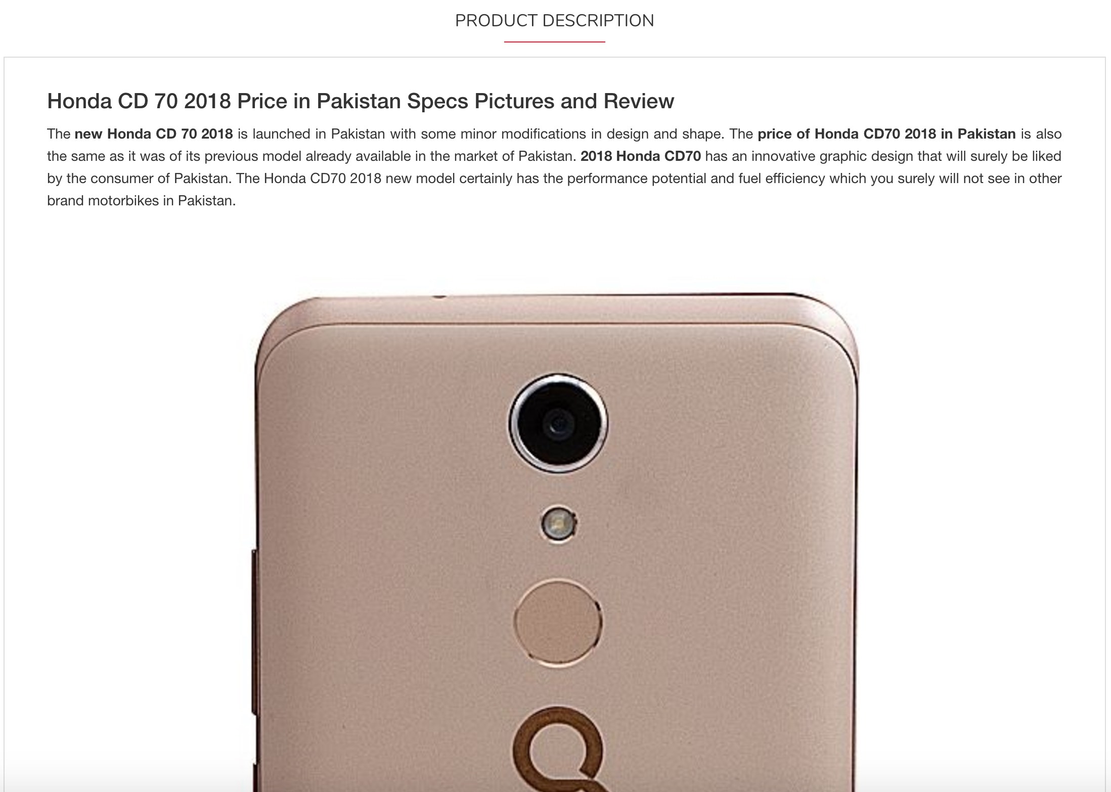
http://comparebox.pk/Motor-Bikes/Honda-CD-70-2018-Price-in-Pakistan-Specs-Pictures-and-Review
And this – mobile ‘Meizu M6’ apparently comes in the shape of a printer
https://comparebox.pk/Mobile-Phones/Meizu-M6-Price-in-Pakistan-Specs-Features

If you are thinking that they might be some ADs in the middle of text description, then I can tell you its not. They were neither clickable nor relevant images. Should be easily fixed by not inserting random images and extract the right images from their content-store (database/file).
Search Result Filtering by Category Checkbox
I searched for Qmobile and got some search results and then filtered by category Tablets, it worked fine but then I removed the checkbox to see all the search results again, and it didnt worked. Firstly, Search Results look like this
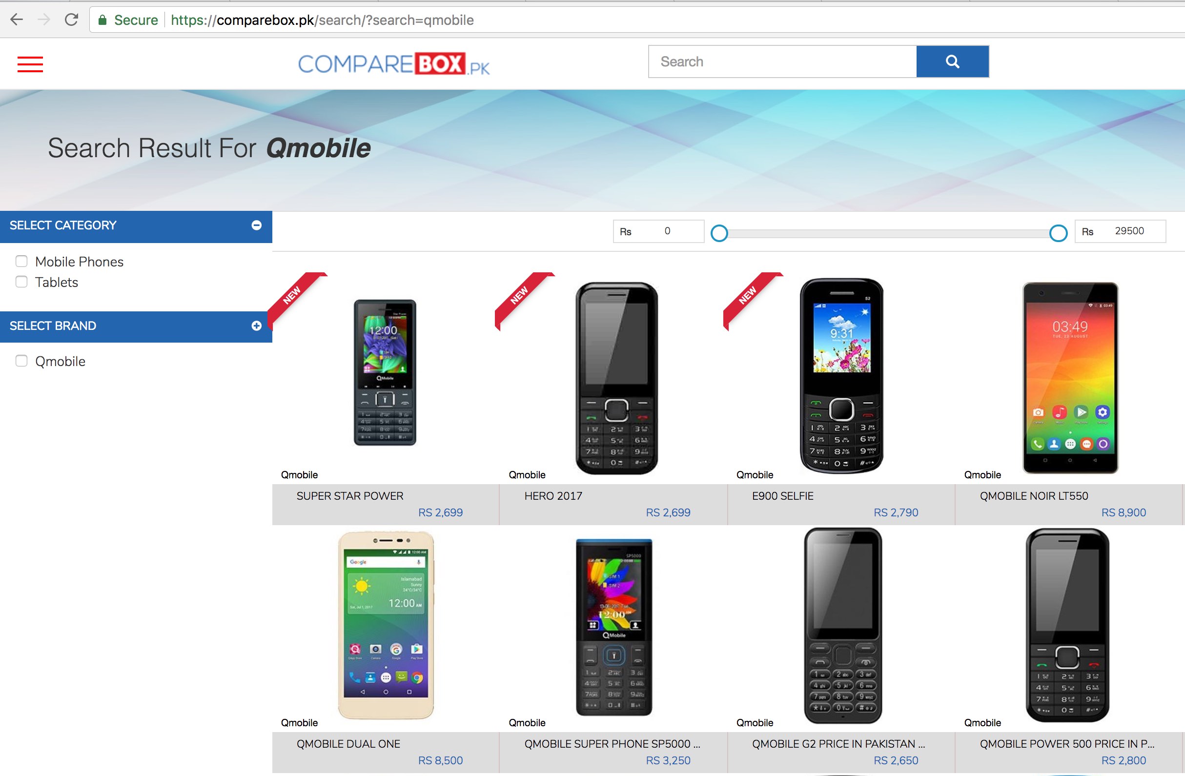
Then, I filtered by Tablets
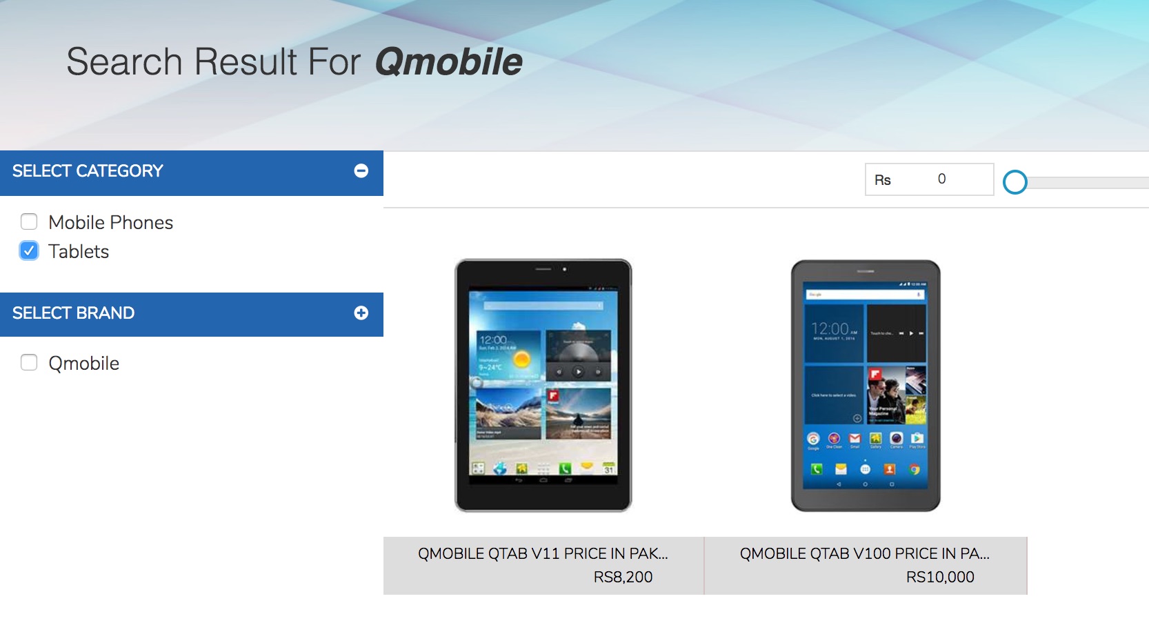
Then, I un-filtered from Tablets. Ideally at this point, it should show all the search results for QMobile again but not!

Finally
This is not the end, as the above review is almost half the things we have shared. The idea is to give a generous review of a service so that it can be improved and rest of the review is only available per request. You can request the full review by email or by leaving a comment on the FB page for this post.
The full review will further cover rest of the website critique including but not limited to,
- Homepage
- ‘Find Seller’ feature
Review Environment
Review is done with the following setup,
– Browser: Google Chrome, Version 60.0.3112.113 (Official Build) (64-bit)
– OS: iOS Sierra, 10.12.6