Pakistan’s largest branchless banking service provider unveils its new digital identity today. easyapisa has recently re-launched its app with new layout and altogether changed look & feel that was taken very well by its customers. Year 2019 has seen major launches by the brand churning out one feature after another. Clarity has reviewed the new interface and here is how the new identify differs form the old one.
The logo:
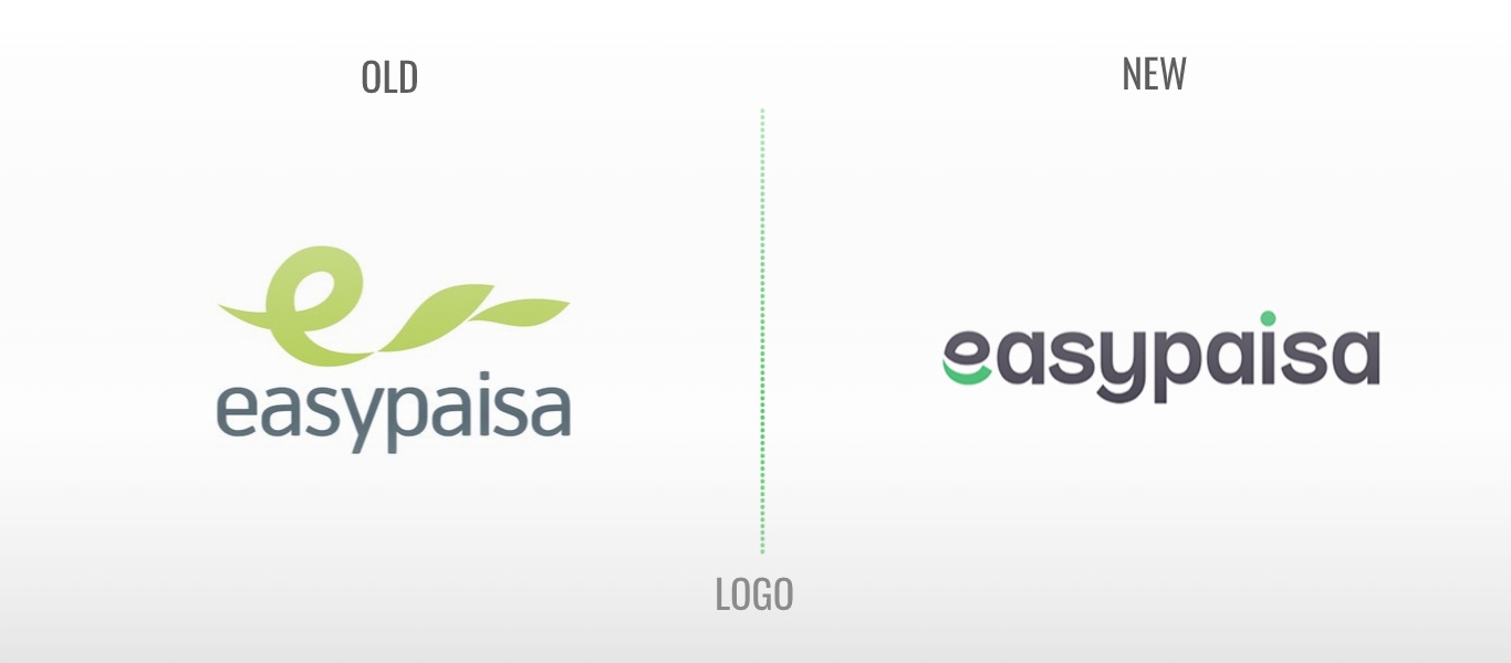
First of all, the brand has changed its logo a bit. Addition of black color adds a serious and authentic look to the logo which is important for a financial app. The trademark green color that brand carried for almost a decade is changed into a cooler new shade of the same color. The rounded edges is more in line with latest logo trends that are followed internationally. Overall the logo looks nice given you can ignore its somehow a resemblance with amazon’s logo. We think its totally coincidental.
Home Screen Layout:
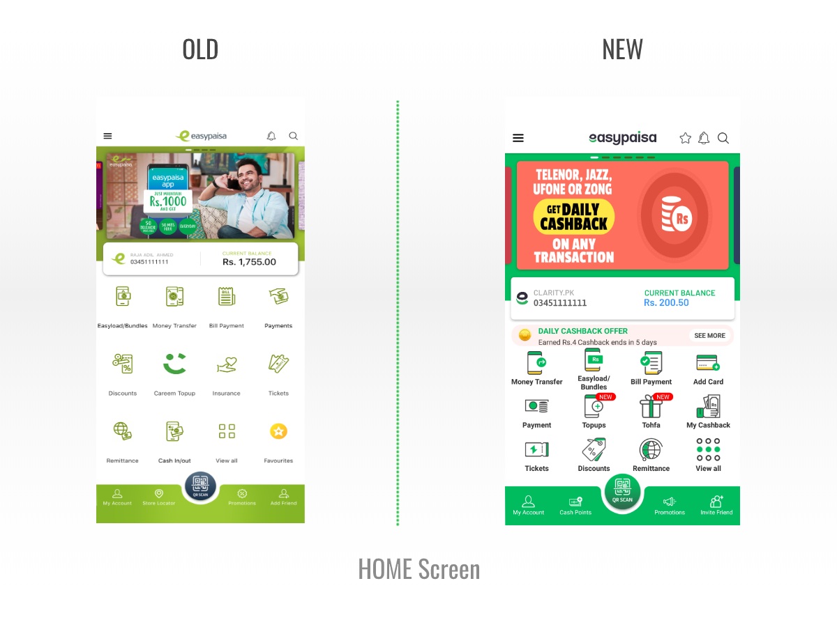
Home screen layout is same as it was with the recent re-launch of the app. However, the icons are new. This time they are made visually more self explanatory with sketchy/artsy feel to them.
Add Card Feature:
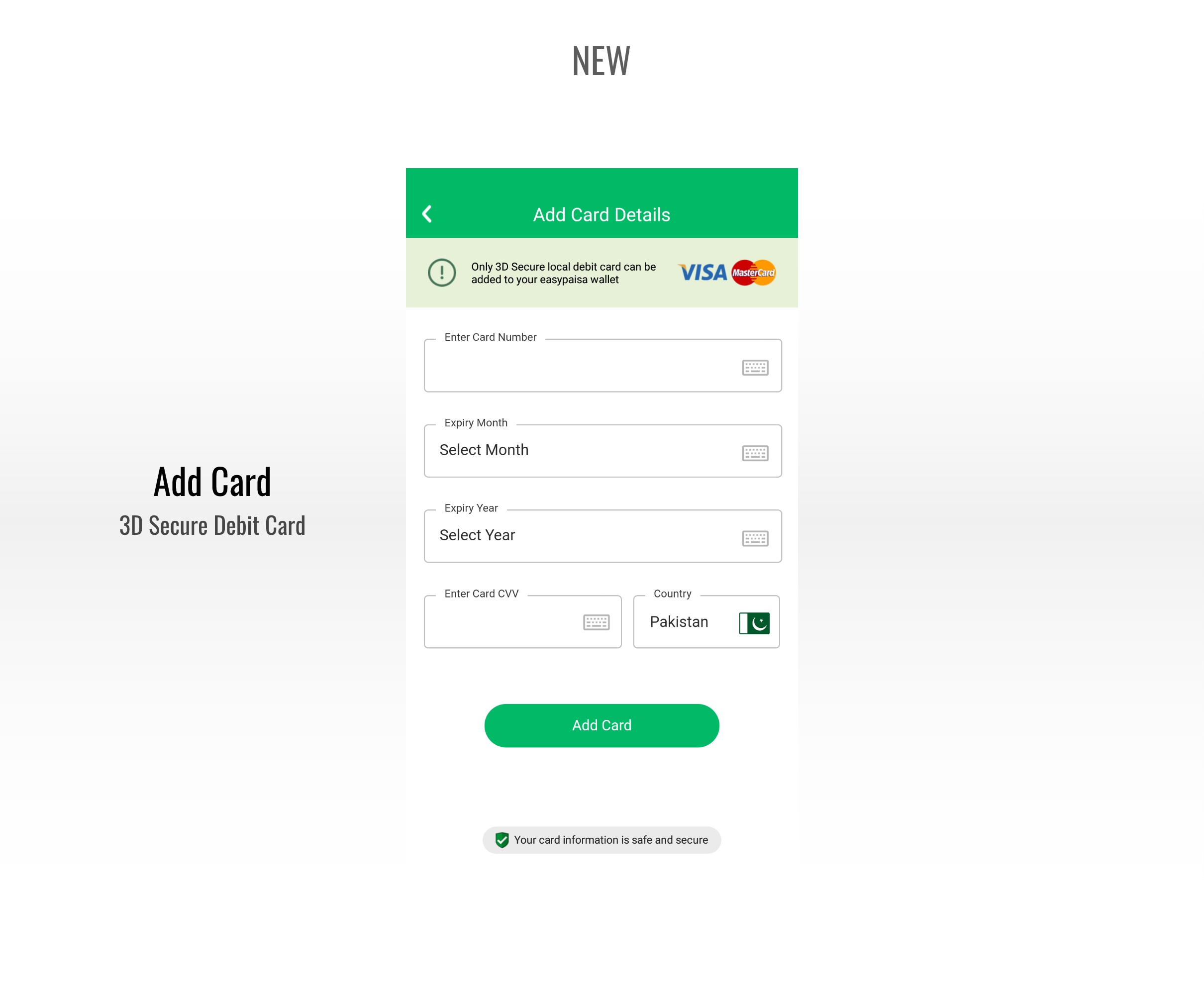
No more trips to retailers for cash deposits, easily add Debit card in your mobile wallet.So, now you can link your 3D secure Debit card with easypaisa mobile account and pull funds into the account directly. This is something new and much needed feature. So many users who have bank accounts and are carrying a debit card always wanted to have some way to use their existing accounts to pull funds into easypasia mobile account. This saves them from going to a retailer for traditional cash deposit facility. This is a good news. Just a check. The service works only on 3D secure debit cards. No Credit Cards and no non-3d secured cards. We hope the brand will work on this in future to serve the complete banked base of the country. Watch this space for detailed review of this feature.

My Cashbacks:
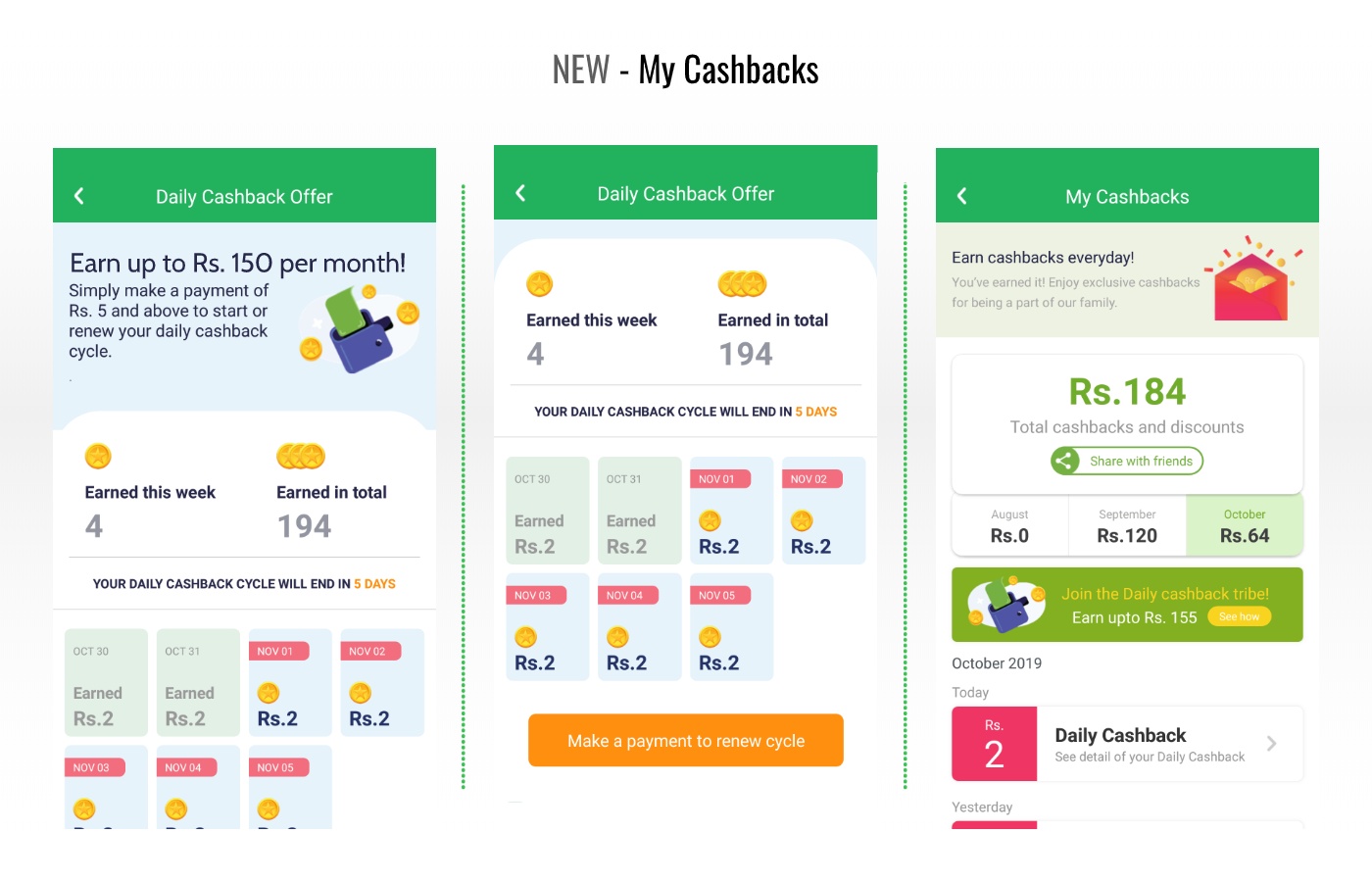
The app now shows a consolidated view of the cash earnings by the customer. The feature has some very pleasing visual layout that tells you how much you earned on daily, weekly and monthly basis and from what campaign of the brand. So, if you have earned it from Invite A Freind feature, you will know this. Or, if you are part of daily cashback campaign, you will see a detailed view of your rewards. This is awesome.
Overall, its fresh and new. Everyone was bored with old identity. Right time to have it fresh with fintech battle firing up!
You might also be interested in:


